Monday, 17 December 2012

Fritz Lang - Metroplolis


Metroplis is a 1927 German expressionist science-fiction film directed by Fritz Lang. The film was written by Lang and his wife Thea Von Harbou, and started Brigitte Helm, Gustav Frohlich, Alfred Abel and Rudolf Klein-Rogge. A silent film, it was produced in the Babelsberg Studios by UFA.


This is kinda weird-creepy, not scary-creepy. But it does fit the theme of 'Out of this World', it does this by looking like the future and alien. The robot looks like the creepier version of C3PO out of star wars.


This does look quite creepy and definatley out of this world. I'm not sure but it looks like a traveling machine, or Teleporter. But perhaps it can only be used by robots, because it's harmful to humans.


James Whale


James Whale was born on 22 July 1889 and passed away on 29 May 1957. He was an English film director, theatre director and actor. He is best remembered for his work in the horror film genre, having directed such classics as Frankenstein (1931), The Old Dark House (1932), The Invisible Man (1933) and Bride of Frankenstein (1935).


This looks creepy because the eyes are
half closed, but this also makes him look
dumb. His scariest or abnormal features
are the scars across his face, and also the
famous frankinstien metal bolt through the
neck.
This is the female version of frankinstein, she looks as freaked about
 the world she's woken up to as we are freaked about her.
At least they didn't put scars on her face, apart
from the weird hair style (it's suppost to be, I know)
she is pretty.


This doesn't look like a horror movie, but I guess
the title brings a little bit of contrast to that statement.
This also looks like a love story but the pair look divided.
The lady proberbly doesn't love the man, but he's head over heals.


Hitchcock

 Hitchcock
This man is said to be one of the best directors out there, he has directed many horror movies. All of which look good.


'This is one of Hitchcock's famous movies, it's a love story between influential filmmaker Alfred Hitchcock and wife Alma Reville during the filming of Psycho in 1959. 
 
 
This is very well layout design. Text is
displayed on top, middle and bottom, the
lower two are slanted anti clockwise, these
are in line with the cast. I find that the guy
is just blatingly holding a knife in front of
what I assume is his wife, who isn't fazed,
she seems if anything proud and looking at
the camera saying, 'you had it coming'. 


Printing

 Cut Out Man Prints


 Alien Hybrids


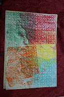
Textures


This is all my work from Pritning with Mark. The 'Cut Out Man Prints' were difficult but enjoyable to make. First you draw a man shape and then cut it out, you can then use either the cut out man or the piece of paper thats been cut out from, as a stencil. Now I learnt the hard way on this one, if you want a nice clean sharp edge, you must stick the stencil down with masking tape, then you can use whatever you like, paint, ink, pastels etc.

The 'Alein Hybrids' were even more fun. First, we had to fold the paper vertically in half, then do as many or few creases as we wanted to. Secondly you draw the alien hybrid you wish, and then cut it out. Thirdly you roll paint or ink over it, and then lay it down on top of a fresh clean piece of paper. Lastly you press down against it with a sppon, and then once your sure you've got every part, you peel it away carefully so not to rip it.

The 'Textures' weren't as exciting as the other two, but it was something other than catch up. Firstly you find a few items that you think may have interresting textures; leaves, paint pot racks, wallpaper, and the table, these are the ones I used. Secondly you lay your sheet of paper over the item and rub the oil pastel over it.This will give you a great texture, especially leaves, they look like veins.


Final Design

This is our team's final design.
We feel that the bluryness of the pictures is a clever way to make out the clown ghost is moving at supernatural speed. The red tint of the pictures and black bckground make it look more scary because red can mean danger and death, black can also represent death.

Individual Design


This is my own individual idea. although I did have Sophie as my model.
The story goes that when the clock struck 4, a Tazzie doll peeked out from behind a rock, and walked round, but as soon as she got down from the rock pool, she vanished, only to spring up and keep on creeping forward, until her face fills the whole frame.
This was a practise shoot you see, we were practising stop start motion pictures and I thought that this could be a great individual idea.


Dines Mixed Media

This is my work, inspired by Dines, who uses different cut up materials and then photograph every single little piece, and then puts them into Photoshop and makes them look like hybrids of some kind.
 
These are the steps I took to get the image above. Please remeber these steps are ones I took using Photoshop.


Research

This piece is great, although it's a little too black and dull for my taste, but it's still a good piece. This particular piece of work has had a structure made for it, so that Dines could makes sure everything stayed in the shape he created. Now I don't see it but I've been told that this piece looks like a horse, I can see a little head of a horse in the left top corner. Other than that I can't see this mysterious horse.


Typography

 
This is my typography work, my very own monster font.
 
 
You only have to follow these steps, to produce this, although it's up to you to design your own font using liquify.
Please do also note that this is using Photoshop.


Tinting


This is my best friend, she was my model, I actually took this picture a little bit before project 2 started, but it's the only image I have of a person with this scary expression. The tinting is very easy really and a lot of fun to see at the end. This is how you tint your images using Photoshop

 
The middle left image is the final product, and the process to that is easily done by following the instruction above, from the top the bottom.


Stina Perrsons

This is an experiment inspired by Stina Perrsons. I took a photo of my best friend, then dragged it into Photoshop, then made a new layer and painted in different shades of purple depending on how dark or light the shadows were. I then went to liquify, and gave it this runny dripping look.


Research

This piece of art doesn't sink well with me, because of the message that I see from it, I can see that the girl may not like the boy she's with and who looks like he's going to kiss her, the colours also express sicklyness, the blue on the other hand is known for it's temperature mood, and the blue gives a chilly cold feel to it. Although in this case it may not be the temerpature meaning but the harsh 'I'm going behind your back' feel, so in fact this girl could be leading him on, for money, drugs, to be popular etc. The dripping also seems to give that sense that these two as a couple aren't going to last much longer, the image will keep on dripping until there is nothing left that we'll be able to identify as the same piece. The reason this piece doesn't sink well with me is that I dislike love fakers and users.


This piece of Stina's sinks better with me than the one above, because there's no private body parts, those are suppost to stay private, unless it's to your lover. The colour purple can represent many moods, for example:
Love, Romance, Heat, Passion, Euphoric, Sensual, Blissful, Joyful, Relaxed, Dreamer, Keen, Perception, Intrigued, Mystical, Impulsive, Mischievous/Sly, Irked, Moody.
I don't like that you can't see the details of the eyes, but then of course thats another thing that can help with identifing what mood the model or the painting is in, the mouth can also help as well.

Frankenstein/Hybrid Man


Levertations

This is a printscreen of how to make it look like your flying or hovering in mid-air. The way to read this is right to left, the 'set foreground colour' step come after the 'paint bucket tool' step.

We were told to go outside with a tripod, and camera, and take two photos, one with the model on something and then take the model and the appartus away and shoot again. We did three of these, although we found out later that one wouldn't be useable, but the two we could were great when we took out the apperatus and made a shadow, me and Sophie edited the first one, which is this one, then I did the other at home.


Health and Safety
To keep safe whilst doing this shoot, we had to make sure that the trolly wouldn't move and would stay stationary.

Red Skull Transformation Photoshoot

 
This was a photoshoot where we had to used body painting, face painting, strobe light effect or making a stop start animation. We chose the face painting although we didn't have any face paints, so we used white board pens instead, it didn't give us the thinkness of the colour we wanted but it did the job.
 
the shoot went well, although we didn't have the correct lighting thoughout. but it's difficult to get Dan to stay still, plus the first three shoots were well lit, but it was disrupting another shoot, who were right next to us, so we had to turn the brightness down, the light intesity also depended on how wide Dan's legs were, as it was positioned beneath him, we used a hard light. I was the one who coloured in Dan's face, and Sophie photographed, whilst Dan of course was the model.
 
Health and Safety
We had to make sure that the pens that we used wouldn't harm the models face by reading the ingredients, we also had to make sure that it would come off.
There was also a danger of tripping on the lighting wires, so we kept those out of tripping range.
The final point was to keep the light from shining in the models eyes, because this can cause blindness if the eyes are exposed to the light for too long.

Tuesday, 11 December 2012

Clown Mask Photoshoots

These are photos I took in my photography lecture, we borrowed a clown costume, and I made the mask in a different lesson, but it was meant for this lesson.  
These particular photos we took in our college's dark room, because of the red lights is the main reason. although I think we should have just used red gels, because the darkness of the room was making it a lot harder for my camera to focus, I should have used P/S/A, then I would have been able to get more focused photos because the more light available, the more quicker the camera can focus. It could also have been a team member as the model moving too fast, I could have improved by instructing him more often and clearly. 
 These photos were the first from using the black background in the actual studio. we had red tinted light provided by a red gel laid over the light, we used hard light because we found it gave a more scary effect to it. The camera still didn't focus as quickly as we wished, but we know for next time we do a photo shoot like this we should have the lighting a little brighter, or set the ISO a little higher.
This was our last photo shoot with the clown costume. It didn't go as well as the one above, but it looks scary enough, although we have to keep in mind that the theme isn't horror, it's supernatural. our model was moving too fast in this shoot, hence why the pictures are blurry, but then vampires move really fast and trail a blur behind them, so this could provide the supernatural look it needs.
 
Evaluation
The photo shoot went well over all, although some of the group could have participated more.   
 
Health and Safety
With each of these shoots we had to be careful with the scissors.
With the first shoot, we had to be carefull of the chemicals because we were in the dark-room.
We had all the red lights on so we could see the room and our surroundings clearly.
As the model couldn't see out of the mask, we had to practise his route a few times, all of them were successfull, he had to take about 6-8 steps. With all three of these shoots, we had to take breaks, to make sure Dan didn't suffocate in the mask.